 CHEATSHEET
No matching results found.
Cheatsheet HTML & CSS
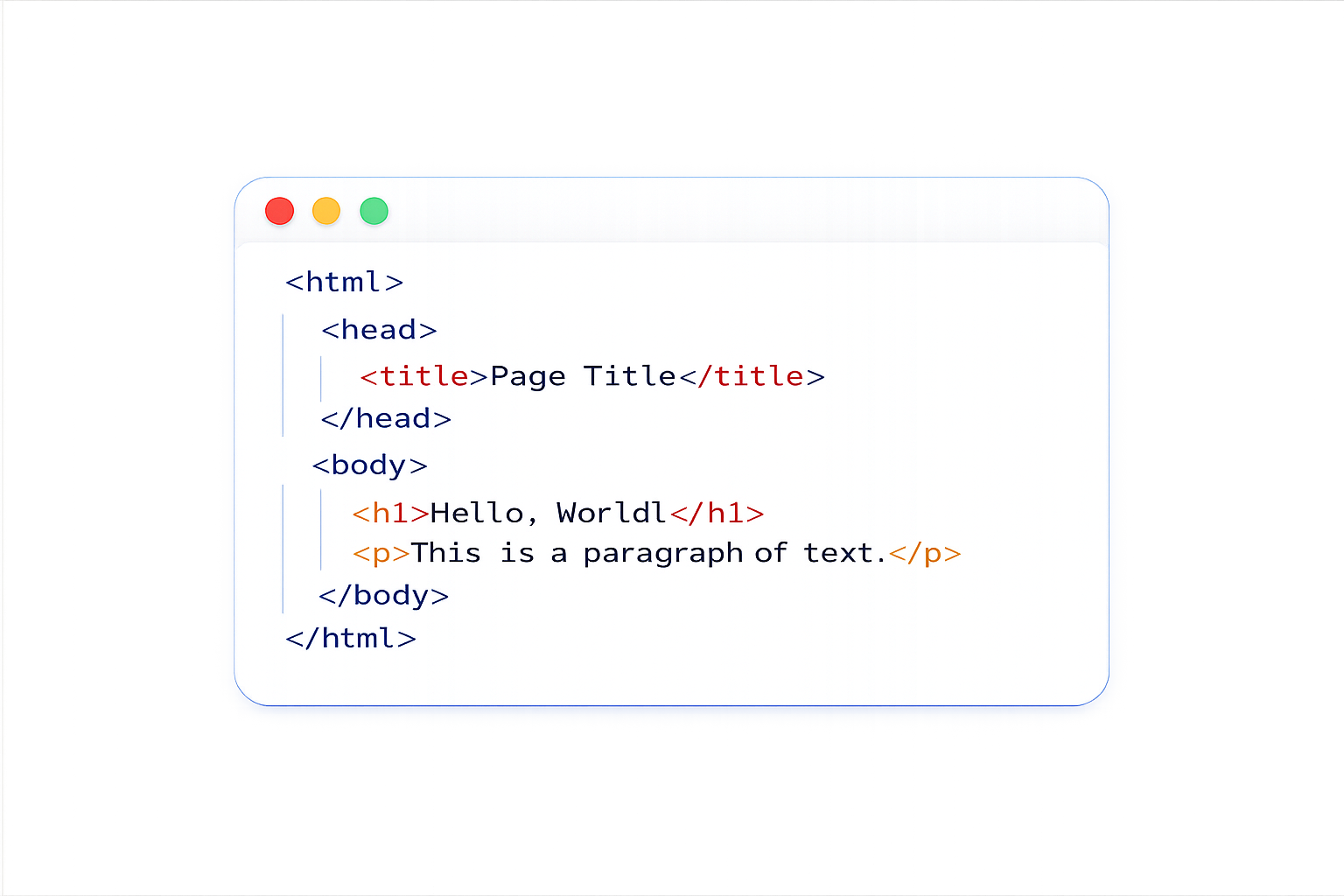
HTML (HyperText Markup Language) and CSS (Cascading Style Sheets) are the fundamental technologies for building web pages. HTML provides the structure of the page, while CSS is used to control the presentation, formatting, and layout.
Here are some key concepts and examples to help you get started with HTML and CSS:
 Concept Concept |
 HTML HTML |
 CSS CSS |
 What it Does What it Does |
|---|---|---|---|
| Basic Structure |
<!DOCTYPE html><html><head><body>
|
__ | Defines page structure |
| Headings |
<h1> → <h6>
|
font-size
|
Titles & hierarchy |
| Paragraph |
<p>
|
line-height
|
Text content |
| Bold / Italic |
<strong>
|
font-weight
|
Text emphasis |
| Link |
<a href="">
|
color, text-decoration
|
Creates hyperlink |
| Image |
<img src="" alt="">
|
width, height
|
Displays image |
| List (bullet) |
<ul><li>
|
list-style
|
Unordered list |
| List (numbered) |
<ol><li>
|
list-style-type
|
Ordered list |
| Table |
<table>, <tr>, <td>, <th>
|
border, border-collapse
|
Data table |
| Form |
<form>, <input>
|
padding, border
|
User input |
| Button |
<button>
|
background-color, cursor
|
Clickable button |
| Container |
<div>
|
display, margin
|
Block container |
| Inline container |
<span>
|
color, font-size
|
Inline styling |
| Layout section |
<section>
|
margin, padding
|
Thematic grouping |
| Navigation |
<nav>
|
display: flex
|
Navigation menu |
| Header / Footer |
<header>
|
background-color
|
Page top/bottom |
- HTML creates the structure of the page.
- CSS controls the style, spacing, colors, and layout.
- Semantic elements like
<header>,<main>, and<section>make your page clearer and more accessible. - Classes are reusable, while IDs should be unique.
Box Model (Very Important)
The CSS box model describes how elements are structured in terms of their content, padding, border, and margin.
Here’s a breakdown of the box model:
| Layer | HTML | CSS Property | Meaning |
|---|---|---|---|
| Content | Text/element |
width, height
|
Actual content |
| Padding | __ |
padding
|
Space inside border |
| Border | __ |
border
|
Edge around content |
| Margin | __ |
margin
|
Space outside element |
- Content is the actual text or element inside the box.
- Padding creates space inside the border.
- Border wraps around the padding and content.
- Margin creates space outside the element.
box-sizing: border-box;makes sizing easier and more predictable.
Flexbox
Flexbox is a one-dimensional CSS layout system used to arrange elements in rows or columns. It is especially useful for alignment, spacing, and creating responsive layouts.
Here are some of the most important Flexbox properties:
| Property | Example | What it Does |
|---|---|---|
| display |
display: flex;
|
Turns an element into a flex container |
| flex-direction |
flex-direction: row;
|
Defines the main direction of flex items |
| justify-content |
justify-content: center;
|
Aligns items along the main axis |
| align-items |
align-items: center;
|
Aligns items along the cross axis |
| flex-wrap |
flex-wrap: wrap;
|
Allows items to move onto a new line |
| gap |
gap: 1rem;
|
Adds space between flex items |
| flex-grow |
flex-grow: 1;
|
Changes the alignment of one specific flex item |
display: flex;turns an element into a flex container.- justify-content aligns items along the main axis.
- align-items aligns items along the cross axis.
- flex-wrap allows items to move onto new lines.
- gap creates spacing between flex items without margins.
CSS Grid
CSS Grid is a two-dimensional layout system used to create complex layouts with rows and columns. It provides powerful control over spacing, alignment, and responsive page structures.
Here are some essential CSS Grid properties:
| Property | Example | What it Does |
|---|---|---|
| display |
display: grid;
|
Turns an element into a grid container |
| grid-template-columns |
grid-template-columns: 1fr 1fr;
|
Defines the number and size of columns |
| grid-template-rows |
grid-template-rows: auto auto;
|
Defines the number and size of rows |
| gap |
gap: 1rem;
|
Adds spacing between grid items |
| repeat() |
repeat(3, 1fr)
|
Repeats column or row patterns |
| fr unit |
1fr
|
Represents a fraction of available space |
| place-items |
place-items: center;
|
Aligns items horizontally and vertically |
| grid-column |
grid-column: 1 / 3;
|
Controls how many columns an item spans |
display: grid;creates a grid container.- grid-template-columns defines column sizes.
- grid-template-rows defines row sizes.
- gap adds spacing between grid items.
repeat()helps create cleaner and reusable grid patterns.
Responsive Design
Responsive design allows websites to adapt to different screen sizes, such as desktops, tablets, and mobile phones. It helps create layouts that remain readable, usable, and visually balanced across devices.
Here are some important responsive design concepts:
| Concept | Example | What it Does |
|---|---|---|
| Viewport Meta Tag |
<meta name="viewport" content="width=device-width, initial-scale=1.0">
|
Makes the page scale correctly on mobile devices |
| Media Query |
@media (max-width: 768px)
|
Applies CSS rules only at specific screen sizes |
| Flexible Width |
width: 100%;
|
Allows elements to resize with their container |
| Max Width |
max-width: 1200px;
|
Prevents content from becoming too wide on large screens |
| Relative Units |
rem, %, vw, vh
|
Creates scalable spacing, sizing, and layouts |
| Mobile First |
min-width
|
Starts styling for small screens, then enhances for larger screens |
| Fluid Typography |
clamp(1rem, 2vw, 2rem)
|
Makes text scale smoothly between minimum and maximum sizes |
| Responsive Images |
max-width: 100%;
|
Prevents images from overflowing their container |
- Media queries help adapt layouts to different screen sizes.
- Relative units like
remand%create flexible layouts. max-width: 100%;prevents images from overflowing.- Mobile-first design starts with small screens and scales upward.
clamp()is useful for fluid and responsive typography.
CSS Selectors
CSS selectors are used to target and style HTML elements. They allow developers to apply styles based on element type, class, ID, state, structure, and more.
Here are some commonly used CSS selectors:
| Selector | Example | What it Does |
|---|---|---|
| Element Selector |
p
|
Selects all paragraph elements |
| Class Selector |
.card
|
Selects elements with a specific class |
| ID Selector |
#header
|
Selects an element with a specific ID |
| Universal Selector |
*
|
Selects all elements |
| Descendant Selector |
.card p
|
Selects paragraphs inside elements with class "card" |
| Child Selector |
.menu > li
|
Selects direct child elements only |
| Pseudo-class |
a:hover
|
Selects elements in a specific state |
| Pseudo-element |
p::before
|
Selects and styles part of an element |
| Attribute Selector |
input[type="text"]
|
Selects elements with a specific attribute |
| Group Selector |
h1, h2, h3
|
Selects multiple elements at once |
- Element selectors target HTML tags directly.
- Class selectors are reusable and start with
. - ID selectors are unique and start with
# - Pseudo-classes target element states like
:hover. - Pseudo-elements style specific parts of elements like
::before.
Accessibility
Web accessibility ensures that websites can be used by everyone, including people with disabilities. Accessible websites improve usability, readability, keyboard navigation, and screen reader support.
Here are some important accessibility concepts and practices:
| Concept | Example | What it Does |
|---|---|---|
| Alt Text |
alt="Profile picture"
|
Describes images for screen readers |
| Semantic HTML |
<header>, <main>, <footer>
|
Provides meaningful page structure |
| ARIA Labels |
aria-label="Close menu"
|
Adds accessible labels for assistive technologies |
| Form Labels |
<label for="email">
|
Associates labels with form inputs |
| Keyboard Navigation |
tabindex="0"
|
Allows navigation using the keyboard |
| Focus States |
:focus, :focus-visible
|
Helps users identify active interactive elements |
| Color Contrast |
color: #fff;
|
Improves readability between text and background |
| Button Accessibility |
<button>
|
Uses proper interactive elements instead of generic divs |
| Accessible Links |
<a href="">
|
Creates navigable and screen-reader-friendly links |
| Screen Reader Support |
aria-hidden="true"
|
Controls what assistive technologies can read |
- Semantic HTML improves screen reader support and page structure.
- Alt text helps describe images for assistive technologies.
- ARIA labels provide additional accessibility information.
- Keyboard navigation is essential for accessible interfaces.
- Focus states help users identify active interactive elements.
Positioning & Display
CSS positioning and display properties control how elements are laid out on a web page.
Here are some key concepts:
| Concept | CSS | What it Does |
|---|---|---|
| Block element |
display: block;
|
Takes full width of container |
| Inline element |
display: inline;
|
stays in line with surrounding content |
| Inline-block |
display: inline-block;
|
Behaves like inline but allows setting width and height |
| Flexbox |
display: flex;
|
Creates a flexible container for aligning and distributing space among items |
| Relative |
position: relative;
|
Positioned relative to its normal position |
| Absolute |
position: absolute;
|
Positioned relative to the nearest positioned ancestor |
| Fixed |
position: fixed;
|
Positioned relative to the viewport, stays in place during scrolling |
| Sticky |
position: sticky;
|
Switches between relative and fixed based on scroll position |
| Clear float |
clear: left;
|
Clears floats on the left side of an element |
| Grid |
display: grid;
|
Creates a grid layout for arranging items in rows and columns |
display: block;makes elements take full available width.display: inline;keeps elements in the text flow.position: relative;keeps the element in normal flow while allowing offsets.position: absolute;positions elements relative to the nearest positioned ancestor.position: sticky;combines relative and fixed positioning during scrolling.